KOSMOS Architects is one of the most promising architecture studios to come out of Russia in recent years. The three founders Artem Kitaev, Leonid Slonimskiy, and Nikolay Martynov, have won competitions for prestigious projects in Moscow’s Gorky Park, such as the sports center “Nike Air BOX Msk” and the temporary exhibition pavilion for the Garage Center of Contemporary Culture. Just recently, they published the book “(Con)temporary (Archi)tecture,” exploring the overlooked beauty of industrial materials.
In our interview, co-founder Artem Kitaev talks about adapting to fast-paced architectural trends, the potential of temporary architecture, and digital technology as a path to more sustainable cities.
TYC: How do you approach your work at Kosmos?
Artem Kitaev (Kosmos Architects): We like to play with typologies and experiment with the role of facades in architecture. Besides that, we do architectural research and also collaborate interdisciplinary with artists, filmmakers, sociologists, or publishers on individual projects. It’s very enriching because we can expand our knowledge and look at a topic from different perspectives. It’s a great way to leave our architectural bubbles. At Kosmos Architects, we are a small and flexible office that works virtually on global projects and partners with construction firms worldwide for the execution.
What projects are you working on at the moment?
Kosmos Architects: We are currently working on a sports center in a park in the Russian city of Kazan, which is shaped like an enormous box. It measures 100 meters in length and 15 meters in height. It was interesting to approach it not only as an aesthetical facade but to give it an additional function. The vast scale of the building is challenging for people to perceive, so we designed it from one side as a landmark, simple but also radical, and from the other side, we tried to break down the scale by integrating facilities and spaces to interact with the facade. The goal was to blur the lines between the building and the park through a smooth transition so that it’s not immediately visible where the greenery starts and the structure ends. It hopefully will be built at the end of this year.
The new project seems to have some parallels to the “Nike Box MSK Sports Center” you designed three years ago, located in Moscow’s Gory Park.
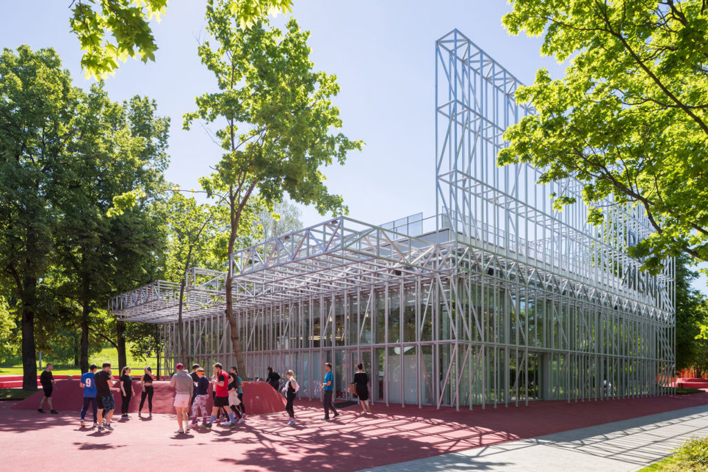
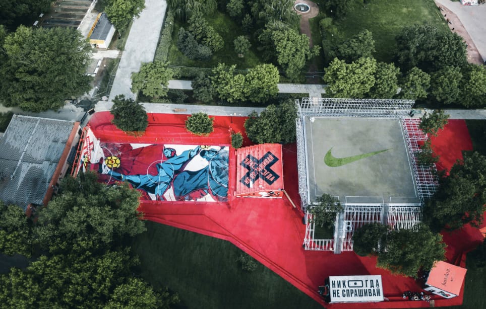
Kosmos Architects: It has a similar approach. In the case of Nike, we were interested in making a fancy building with the rough aesthetics of the suburbs. We thought about landmarks on the outskirts of Moscow and came up with billboards because, in these homogeneous housing blocks, they are often the only signs that give orientation and, for example, show where to find the next supermarket. These billboards have an interesting frame structure, which was our source of inspiration for the facade. It has pull-up bars, snake bars, push-up bars, etc. and serves as a street workout facility for warming-up, parkour, and other sports activities. The actual sign of the billboard works as a digital screen for announcements or video art. The facade is entirely transparent, so everything that is happening on the court is visible from the outside. The social aspect of making people interested in the facility was crucial to us. It’s a building that interacts and communicates with the people. The idea was to activate the sports life in the city center, and we had to bring together different communities like football players, basketball players, and runners. There is also a small event venue in the facility that serves for lectures on design and architecture.
You won another competition for a project in Gorky Park to build the temporary exhibition space for the Garage Museum of Contemporary Art. What was the most challenging part of this project?
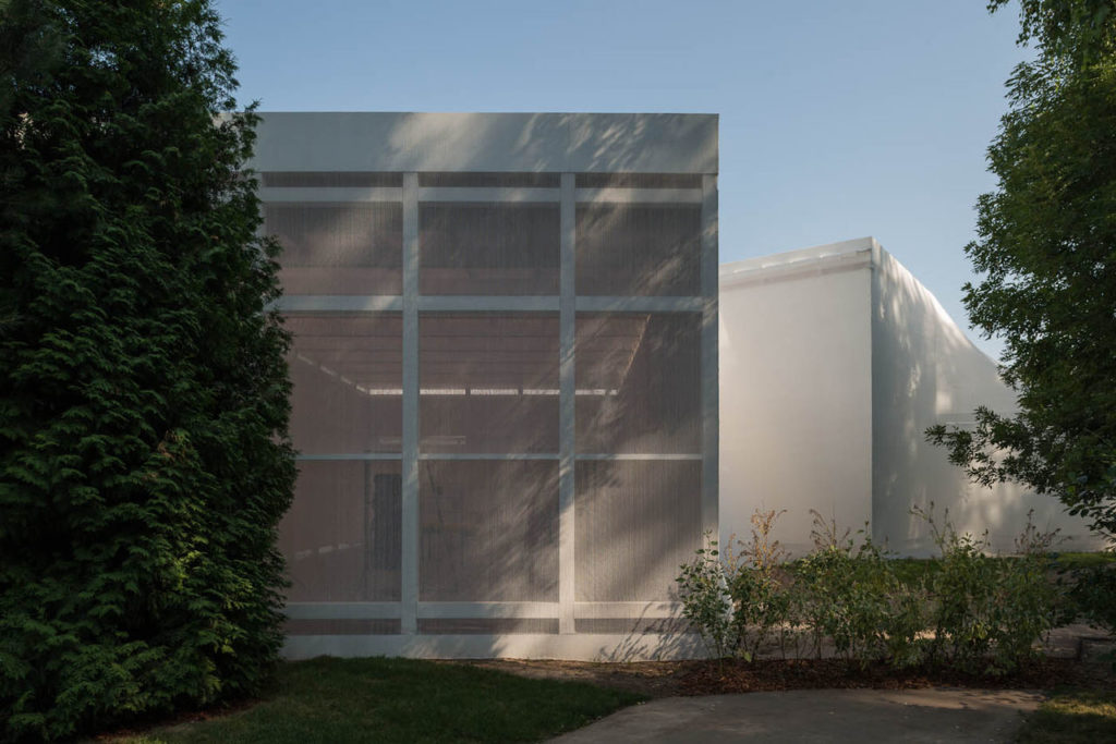
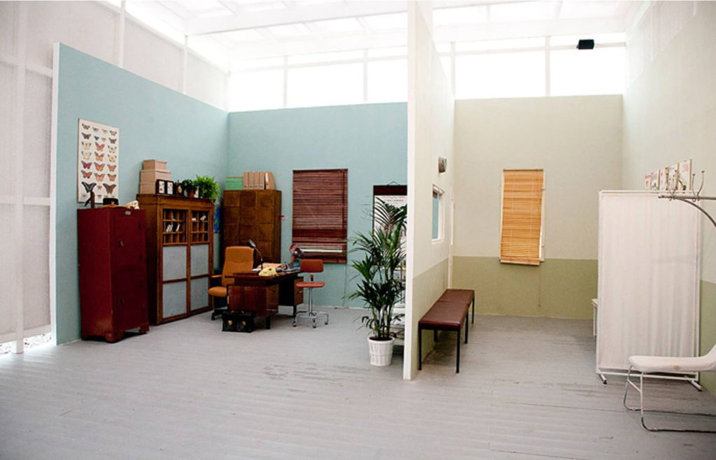
Kosmos Architects: We only had a minimal budget and almost no time. It was just two months from the proposal to the finished structure. We wanted to experiment and do something interesting. On one side, we had to satisfy the museum’s request for the exhibition program. Hence, we located the exhibition halls in Gorky Park between the trees. It was inspired by the soviet classicist Hexagon pavilion designed by architect Ivan Zholtovskiy and located right next to the site.
But we wanted to do something more surprising and thought about what kind of material to apply, something that was cheap and unexpected. Then, we came up with this construction net called Debris netting. It’s an incredible material because it’s very elastic, similar to nylon stockings. We used the net to cover the cubes and created a matching geometry with the edges of the pavilions and the netting. That was our first experience working with industrial materials and temporary architecture.
And then you continued doing temporary projects with lower budgets?
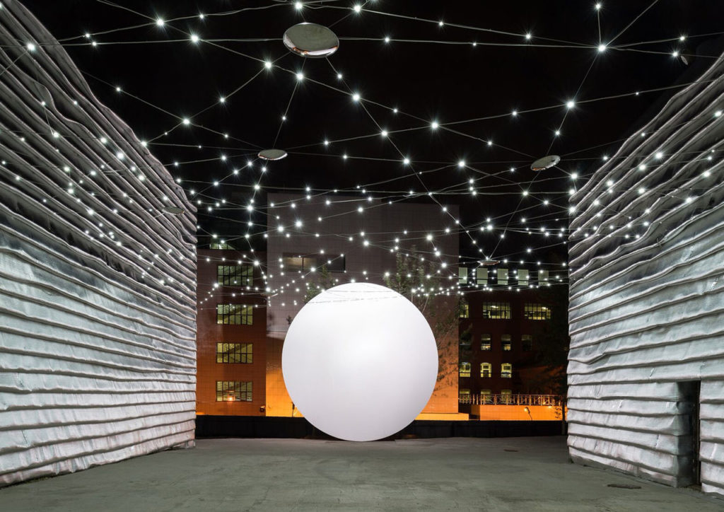
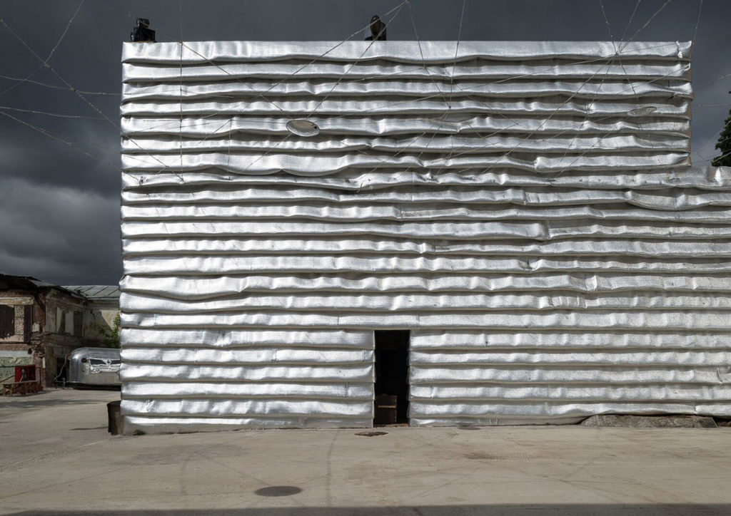
Kosmos Architects: For example, the EMA space was a revitalization of an ex-industrial territory in the center of Moscow that we transformed into a new cultural hub. We used insulation foil, which has a glossy appearance and covers the whole facade. The space was supposed to accommodate different cultural activities like lectures, concerts, or even techno parties. We wanted to create a mutual but active background, and this foil worked very well because it fits all cultural occasions. It was a great match regarding material, costs, and appearance. We wanted to create a background that would animate people to take selfies and put them on Instagram, which worked very well. Today, that’s nothing new anymore, but five years ago, having an Instagramable selfie spot in the space wasn’t that common. Now, that’s crucial for every architect, and a place to be shared on Instagram is a primary concern that drives clients’ and designers’ ambitions.
Do you think many architecture firms design for Instagram?
Kosmos Architects: That’s already happening. It’s interesting because digital renders have become very detailed and create such a realistic atmosphere that architects can react to the fast-paced trends on Instagram and immediately satisfy the user’s need for architectural design without having to construct an actual building. Additionally, in real spaces, they achieve the same effect through digital technology. Although it’s just virtual, it will already make a statement in architectural design and is seen by millions of users worldwide. It will influence their vision and attitude towards architecture. So, if we see it like that, we could ask ourselves if it’s even necessary to waste resources to build permanent structures when renderings or less expensive and more flexible temporary architecture can do the job.
What role could temporary architecture play in the cities of the future?
Kosmos Architects: It could play an essential role as today, so many resources go into renovations and the organization of buildings. As I mentioned before, the aesthetic vision of architecture and technological development is so fast-paced that there is a high chance that structures in the future will be less permanent but more adaptable, ecological, and easier to manage. Large-format printing technology which allows us to print any image in a scale of a buildings facade are exciting in that sense because we don’t need to make a facade of, for example, real marvel when we can just print it instead. Large-format printing and facade banners enable architects to dress facades like fashion designers dress models for a catwalk show. And when a design is outdated, it will be replaced by a different trend. Considering that we live in a more and more digital world, architecture could become like Hollywood film sets that can be adjusted, rebuilt, and reused according to the latest social trends, which is much more ecological than maintaining or demolishing permanent buildings.
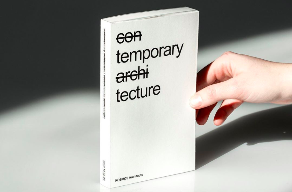
You will soon publish a book on temporary infrastructure with the title “(Con)temporary (Archi)tecture.” How did you approach this project?
Kosmos Architects: The word architecture consists of two Greek roots Archi – author and Tecture – structure. So in the term architecture, we crossed out Archi to emphasize our focus on Tecture – anonymous structures. In the word contemporary, we crossed out Con to keep the focus on Temporary. Generally, in this book, we try to understand what contemporary architecture can learn from temporary structures.
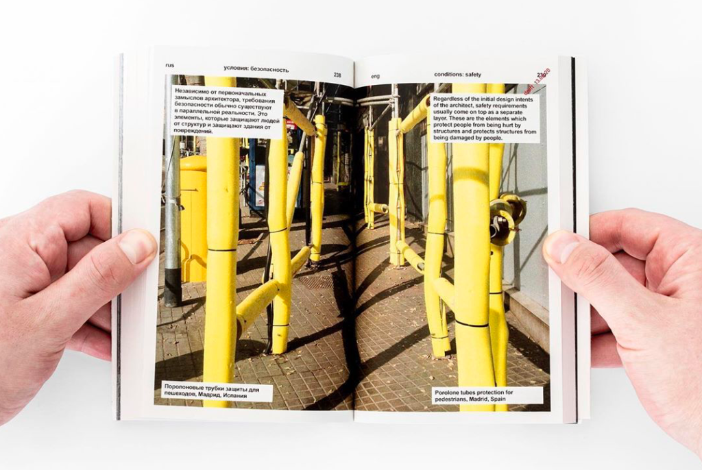
The book introduces industrial materials that architects don’t usually consider for design. It’s not something that architects would apply for a beautiful facade. I already mentioned some of them from our previous projects, like the construction net and the foil. Some other examples are spikes, razor wire, or scaffoldings. The temporary infrastructure was a source of inspiration because it’s functional, but it also offers an unusual aesthetic. As architects, we work in the fields of social discourse and beauty. Still, there is an alternative logic to the architectural address, and these are the structural objects that people often perceive as ugly. But we see a lot of beauty in them. Architects rarely consider them in their designs, although they will be applied to all the buildings for maintenance. We call them “materials that protect people from being hurt by buildings” or “structures that protect buildings from getting damaged by people.” The book examines what attracts us to these elements and how they work together. We try to systemize this knowledge and explain why this kind of anonymous architecture appeals to us.
What exactly do you mean by anonymous architecture?
Kosmos Architects: It’s anonymous architecture because some unknown companies or engineers created it, not thinking of the aesthetic aspect of the material or promoting it as design. You can probably find out who invented it through research, but it’s not immediately visible. It’s a very modest form of architecture, which is all about functionality. The exciting thing about temporary infrastructure is that it is not often judged from an aesthetical point of view. Architecture is usually significantly regulated by law and follows strict aesthetic rules. But Tecture is entirely free. That’s also interesting if we think about the relationship between design and technology. First, there is a technological invention purely focused on function, and then afterward, we start beautifying the technology, and then we accept it as design. We recreate it by applying specific rules and laws of aesthetics, which we then follow for thousands of years.
For example? Can you explain this in more detail?
Kosmos Architects: The early architecture was a functional and straightforward wood structure with beams and columns. It was an efficient and technical system with the only goal of creating shelter and protection from the elements. Later, this simple wood structure was translated into stone architecture, where many wood technical details were transferred into pure decorative stone elements. The practical wood structure, which was created out of need, was initialized and documented in the “law of beauty” for stone architecture. We perceive these stone beams, columns, and proportions as beautiful, but they lack the essence of it, which was its functionality and practicality. With tecture that’s different, nobody ever regulated it. It doesn’t follow any aesthetic rules. That’s what makes it so innovative and exciting. It’s an architectural playground free to explore. Often, contemporary architecture tries to be brave, creative, and beautiful, but all within the boundaries of conventional compositional rules. That’s why many times it fails this objective, whereas tecture doesn’t try any of it but at the same time manages all of it. It’s radical, explicit, and innovative. Tecture doesn’t invent any beauty; it doesn’t try to invent. The only thing it does is to solve an urgent problem and satisfy a specific need for maintenance or protection.
So temporary infrastructure is a kind of unrecognized genius in architecture?
Kosmos Architects: These temporary structures are essential to every city as buildings require constant maintenance and updates in construction and renovation. In well-preserved places like Venice or Milan, we can see many temporary structures covering facades of historical monuments visited by thousands of tourists daily. We are disappointed if we can not take a selfie in front of the Colosseum from the same angle we have seen in pictures on the internet. But there are already millions of photos like these, so there is no need for another one. It might be much more original and exciting to photograph a monument with a temporary structure like a net covering the facade because it captures a moment in the evolution of a city that might already be gone the next day.


